FTC disclaimer: This post contains affiliate links and I will be compensated if you make a purchase after clicking on my link.
Coursera is one of the largest educational platforms of massive open online courses, specialization and certifications in various disciplines from world’s best universities and organisations.
Through the audit option, it allows learners to take the courses for free without an official credit in the form of course completion certificate.
Also, if you enroll to courses that are part of a specialization, you have to opt for monthly subscriptions to get course completion certificate.
Mostly taught by university professors and pioneers of particular field, the course have short video lectures, structured course materials, quizzes to challenge one’s knowledge, graded assignments with flexible deadlines and community forums for support and queries.
Talking of coursera data visualization, the MOOC platform has handful of them from IBM, PWC, Duke University, University of Michigan, JHU, Illinois,etc.
Data visualization is all about understanding and gaining insights from data patterns in the form of various graphical representations (chart, diagram, picture, bars, etc).
We have listed below the best Coursera data management and visualization courses you can study in the field of data analytics.
Data Visualization with Python – IBM
This Coursera data visualization certificate program from IBM presents you different data visualization tools and libraries for better understanding data and make meaningful insights.
It is the 7th course of the total 9 course IBM data science specialization and takes you approximately 8 hours to learn and practice.
Course Ratings: 4.6+ from 1,190+ students
Key Learning’s from the Course:
- Learn about the history and architecture of Matplotlib and how to perform basic plotting with Matplotlib
- How to read, process and manipulate data in pandas DataFrame
- What are area plots, histograms, bar charts, pie charts, box plots, etc and how to create them in Matplotlib
- Learn advanced visualization tools like waffle charts and word clouds and how to create them
- How to create regression plots using a visualization library called seaborn
- How to design geospatial data with Folium
- How to use Folium to create choropleth maps
Who is this course best suited? If you want a solid understanding of visualisation tools with hands-on IBM lab exercises
Skills Gained from the Course: Python Programming, Data Virtualization, Data Visualization (DataViz) and Matplotlib
Data Visualization Coursera Review

Data Visualization and Communication with Tableau – Duke University
The Data Visualization tableau Coursera course talks about how to use a data visualization tool called Tableau and get useful data insights for businesses.
It is the third course of 5 course series of analytic techniques for business specialization offered by Duke University.
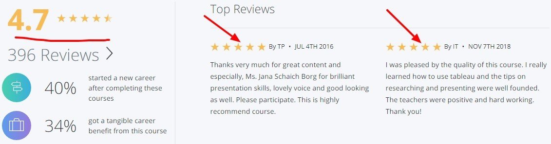
Course Ratings: 4.7+ from 1,830+ students
Key Learning’s from the Course:
- How to install Tableau Desktop and use the program by working with two data sets
- Know how to create graphs in business analysis and transform data in Tableau
- Dynamic data manipulation and presentation in Tableau
- How to master at getting people to agree with data driven business recommendations
- Be able to do effective communication of business relevant implications of data analyses
Who is this course best suited? Business data analysts looking to learn Tableau for data visualization purposes
Skills Gained from the Course: Data Analysis, Tableau Software, Data Visualization (DataViz) and Visualization (Computer Graphics)
Course Reviews
Data Management and Visualization – Wesleyan University
The Coursera data management and visualization course teaches how to use two powerful data analysis tools (SAS and Python) to manage and visualize data.
This is the introductory course of the 5 course series of data analysis and interpretation specialization offered by Wesleyan University.
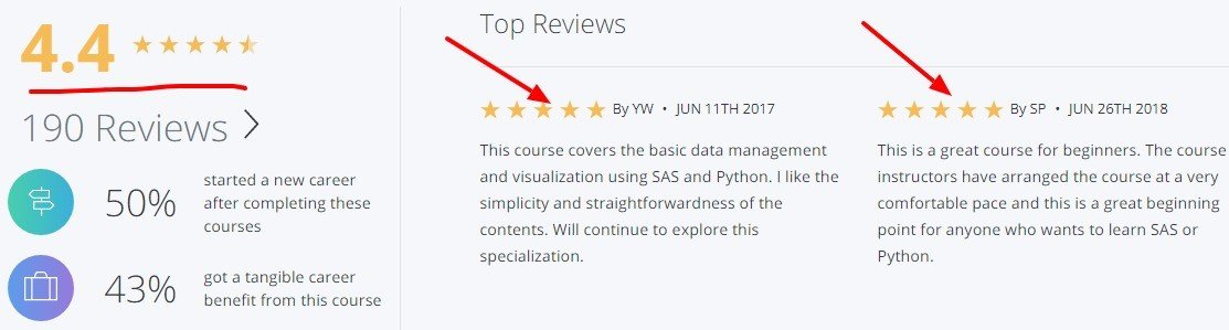
Course Ratings: 4.4+ from 671+ students
Key Learning’s from the Course:
- Introduction to the data analysis basics
- How to write a basic program in SAS or Python to load a data set and examine frequency distributions
- The nitty gritty of data management when working with a data set
- What is descriptive statistics and how to visualize data variables using graphs
Who is this course best suited? Learn data analysis along with Python and SAS programming
Skills Gained from the Course: SAS Language, Data Analysis, Python Programming and Data Management
Data Management and Visualization Coursera Review:
Fundamentals of Visualization with Tableau – UCDavis
Another equally good data visualization tableau Coursera Course from University of California, it gives an overview of data visualization concepts with Tableau.
This is course 1 of their 5 course Data Visualization with Tableau specialization.
Course Ratings: 4.4+ from 1,778+ students
Key Learning’s from the Course:
- Install Tableau software and create a visualization with data sets
- Examination and navigation of Tableau software
- Practice and connect to different data sources
- Examine ways to define your project
Who is this course best suited? Beginners looking to learn data visualization with Tableau basics
Skills Gained from the Course: Tableau Software, Data Virtualization, Data Visualization (DataViz) and Visualization (Computer Graphics)
Course Reviews:

Data Visualization – Illinois
The data visualization Coursera course from Illinois is the introductory course of their popular Data mining specialization.
Course Ratings: 4.5+ from 698+ students
Key Learning’s from the Course:
- Explore different types of visualization and how humans perceive information
- How to visualize data using charts, glyphs, parallel coordinates, streamgraphs, etc
- How to visualize graphs of non-numerical data
- Be able to design your own visualization systems for large datasets and dashboards
- Learn how to interpret visualization from the data sets you have created
Who is this course best suited? If you are looking for an overview of theoretical concept of visualizations
Skills Gained from the Course: Data Visualization Software, Tableau Software, Data Virtualization and Data Visualization (DataViz)
Course Reviews

Do you recommend other Coursera Data Visualization courses worth enrolling into? Let us know in the comments.
Happy Learning!